Project Overview
The main goal was to translate the energy of a live fitness event into a digital environment. The visual strategy focused on bold contrasts, immersive imagery, and responsive layouts that worked seamlessly across desktop and mobile.
Create a campaign that communicates movement, performance, and modern fitness culture. All while keeping the interface intuitive, conversion-focused, and on-brand.
Details
Time Frame:
Aug 2022
Role:
Art Director, UI Designer, UX Designer
Involvement:
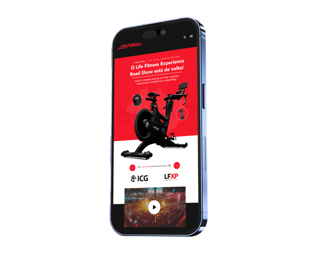
Landing Page Design, Mobile Adaptation
Tool used:
Figma, Adobe XD, Photoshop
Solution
These are the places where customers interact with the brand, such as the website, social media, retail environments, customer service, and advertising. Each touchpoint should provide a consistent and coherent brand experience. The ease and satisfaction with which customers can interact with the brand’s products or services. Good UX is crucial in digital branding.
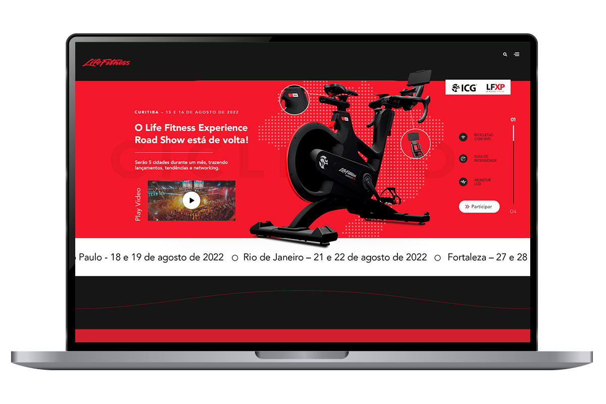
- Created a responsive landing page that adapts to all screens
- Used a high-energy palette (red, black, and white) to convey strength and excitement
- Continuously monitor brand performance and customer perceptions
- Applied clean typographic choices (Avenir) for accessibility and structure
Colors
The visual identity is built around a high-contrast color palette and clean typography.
Red (#d1121e) brings energy and urgency, aligning with the brand’s dynamic and performance-driven tone. Black (#1c1c1c) adds strength and depth, while white (#ffffff) creates balance and clarity across layouts.
The chosen typeface, Avenir, offers a modern and geometric feel that reinforces precision and professionalism. Its clean structure ensures excellent readability across devices, from desktop to mobile.
Results
The final design delivered a consistent and immersive brand experience. From motion-driven visuals to bold mobile layouts, the project captured the essence of Life Fitness and aligned with the brand’s global tone.


